(From a blog post originally published on Xola University)
What’s the one thing that stands between you and online customers? Your call-to-action, or CTA. This may sound jargony, but rest assured, you’ve seen them everywhere. (For example: “Add to Cart” and “Add to Wish List” buttons are CTAs.)
Designing the right calls-to-action is both an art and a science. They come in all shapes, colors, sizes, and fonts. The same action can be communicated in diverse ways. Nail the CTA, and selling tours online will be that much easier.
There are two important things to consider when designing a call-to-action: style and content.
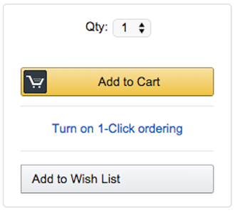
Style can mean a lot of things, but let’s focus first on color. There is no single end-all-be-all color for converting the most visitors. But color does matter when it comes to conversions, as this example from Amazon illustrates.
 There are two CTAs in the example on the right. Notice anything about the color of these two buttons? The important one, which initiates the actual purchasing process, is yellow. Yellow stands out against the white background.
The “Add to Wish List” button, on the other hand, is white. It blends in with its surroundings. Why? Because Amazon, the vendor in this case, wants people to add things to their cart, not add things to their wish list, which they may or may not buy later.
Now, let’s apply this to adventure park and zip tour operators.
Rule #1: Although there is no single foolproof CTA color, the color of your CTA must stand out from its background.
Deciding on the optimal hue might simply be a question of preference. There is plenty of research into the psychology of color choices, such as the idea that redder tones connote “stop” and therefore get people to pay attention. But it also denotes “caution.” That might discourage someone from buying.

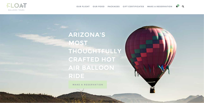
What do you think when you see this web page above? (Here’s a link if you want to see it in action.) It’s beautiful, no doubt, with a stunning image that pleases the eye. Can you spot the CTA, though? It’s right there, under the large, white writing. The light green blends in with the light blue background of the picture, making the call-to-action less effective.


