

This tour provider would do better with a bolder call to action. Consider something like this:
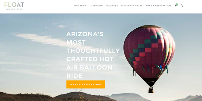
In this case, the golden-yellow, which is within the website’s color palette, stands out against the lighter backdrop.
Here’s a second example using another bright color in this site’s palette:
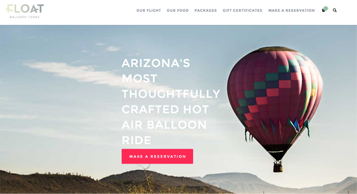
Both the pinkish-red and the golden-yellow buttons stand out more than the original mint green CTA. Clearly, color makes a huge difference.
Now, let’s consider the message.
Rule #2: A CTA should succinctly and clearly communicate the action that will follow.
The second, crucial thing to consider when designing a CTA is to determine what action you want visitors to take. Do you want them to reserve a spot, get their reservation, book a tour, buy now, or something else? There are many ways to say essentially the same thing, so test different CTAs and see which one converts the best.
That said, a CTA should be short and sweet, not the next Great American Novel. Time is always of the essence when you’re getting someone to take action online. The fewer barriers, the better.
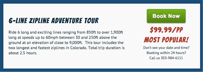
At Xola, we take all this advice to heart when we design CTAs for our clients. Typically, we use bright green “Book Now” buttons. It’s rare for websites to have neon green backgrounds, and “Book Now” clearly conveys what the action will be after clicking. A standout color and a simple, clear message add an element of urgency to the purchase.
Your Next Steps
Your online presence is crucial in today’s digital world. Give your website a boost by evaluating your calls-to-action. Do they stand out? Do they clearly communicate what a customer should do? If your booking software provides buttons for your site, is the provider open to helping you find the right design for your site? If not, why?
Your booking software provider should be a partner and advisor on which CTAs work best for your website. Having the wrong CTAs could seriously impact your business, so the provider should have your best interests in mind.
Remember, a call-to-action is the one thing standing between you and a customer. If it is not spot-on, you could be undermining your online revenue potential. So give some thought to how your CTA designs help or hurt your goals. Have some fun with it, and happy designing!
 in a Pandemic")

 on Google Maps")