

In the previous installment of this series, I spoke to the rising influence of mobile across the zip line and adventure park industry as well as among other sectors. My goal was to emphasize mobile’s ramifications on your revenue and your brand.
Now, we’re going to dig deeper into the nitty-gritty of mobile design so that you can undertake a flawless mobile overhaul.
Why does mobile design matter?
Mobile design exists because one cannot translate a website made for a 13-inch screen to a 4-inch screen.
Since people rely more on their phones for functions formerly reserved for desktops and laptops, you need different designs for mobile users and desktop visitors. A person on a mobile device may access the same website as someone on a laptop, but their search experiences often look totally different.
Someone on a phone is more likely to browse at a frantic, rushed pace. It’s not easy to move quickly on a small touchscreen, however, unless you design it for that purpose.
Consider the mobile user’s experience when planning your site’s layout. Some aspects of your website that appeal to desktop visitors may deter those on a smartphone or tablet.
As one design service explains, the key thing to remember is that “there’s a premium attached to screen space on mobile devices. Keep it minimal and focus on the key message you want the user to take away.”
How to know if you need a mobile redesign
Overall, zip lines and adventure parks are pushing the boundaries of mobile design. Regardless of your business’s mobile traffic currently, it’s time to join the rest of the industry and invest in a mobile experience for your customers—or risk falling behind.
Without further ado, then, let’s dive into the three different levels of mobile design and their diverse features.
1. Mobile Friendly
These sites are not very friendly at all, actually. A mobile friendly site mirrors the layout of a desktop site for the most part, but it might have such added bonuses as:
- Email addresses, phone numbers, or directions that can trigger an action on your phone
- Slideshows that don’t need Adobe Flash (which isn’t supported on Apple and other mobile devices)
- Smaller image files that allow for quicker loading times on mobile connections
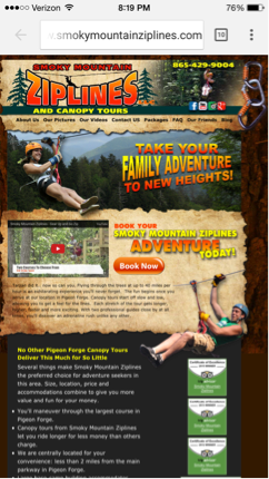 Despite having a chipper-sounding name, mobile friendly sites like this one don’t pass Google’s Mobilegeddon test. These sites don’t work because they fail to consider how hard it is for someone’s thumbs to navigate all these small links. Anyone that visits this site from a phone or tablet will suffer through a lot of “screen-pinching” if she wants to get anywhere.
(Adding confusion, of course, is the fact that Google calls its Mobilegeddon test the “Mobile-Friendly Test.” Sites that pass the test will fall into the next two categories of mobile design. If you’re having a hard time keeping all the names straight, just try to focus on the characteristics of each design type.)
A mobile friendly website is only acceptable if you don’t attract a significant mobile audience to your site and if you don’t have the budget for a redesign quite yet. But remember, the longer you offer this mobile experience, the more you risk falling behind competitors that are quickly updating their designs.
2. Mobile Optimized
Your customers (and Google) will expect this—or responsive design, which we’ll discuss in the next section—when they come to your site from their phones.
The difference between “optimized” and “friendly” sites is that on the former, the content is laid out uniquely for a mobile screen. The most noticeable advantage of a mobile optimized site is having larger buttons and formatted content for quick and easy navigation.
 in a Pandemic")

